Product Hunt · 2019–2020
Product Hub Redesign
How I increased click-through rates to maker websites by 32% through data-driven design decisions and focused content hierarchy.
TL;DR
Product Hubs weren't driving clicks to maker websites. I analyzed heatmaps and click tracking to identify what users actually cared about, then redesigned the page hierarchy to prioritize product understanding and maker site clicks while removing competing CTAs and vanity metrics.
The redesign increased click-through rates to maker websites by +32%, drove +21% more pages per session, and reduced bounce rates through focused content hierarchy and streamlined CTAs.
01 · The Problem
Product Hubs Weren't Driving Traffic to Makers
Product Hubs showed a product's full launch history, but users weren't clicking through to maker websites. Awards, aggregate metrics, and a noisy activity feed competed for attention against the primary CTA.
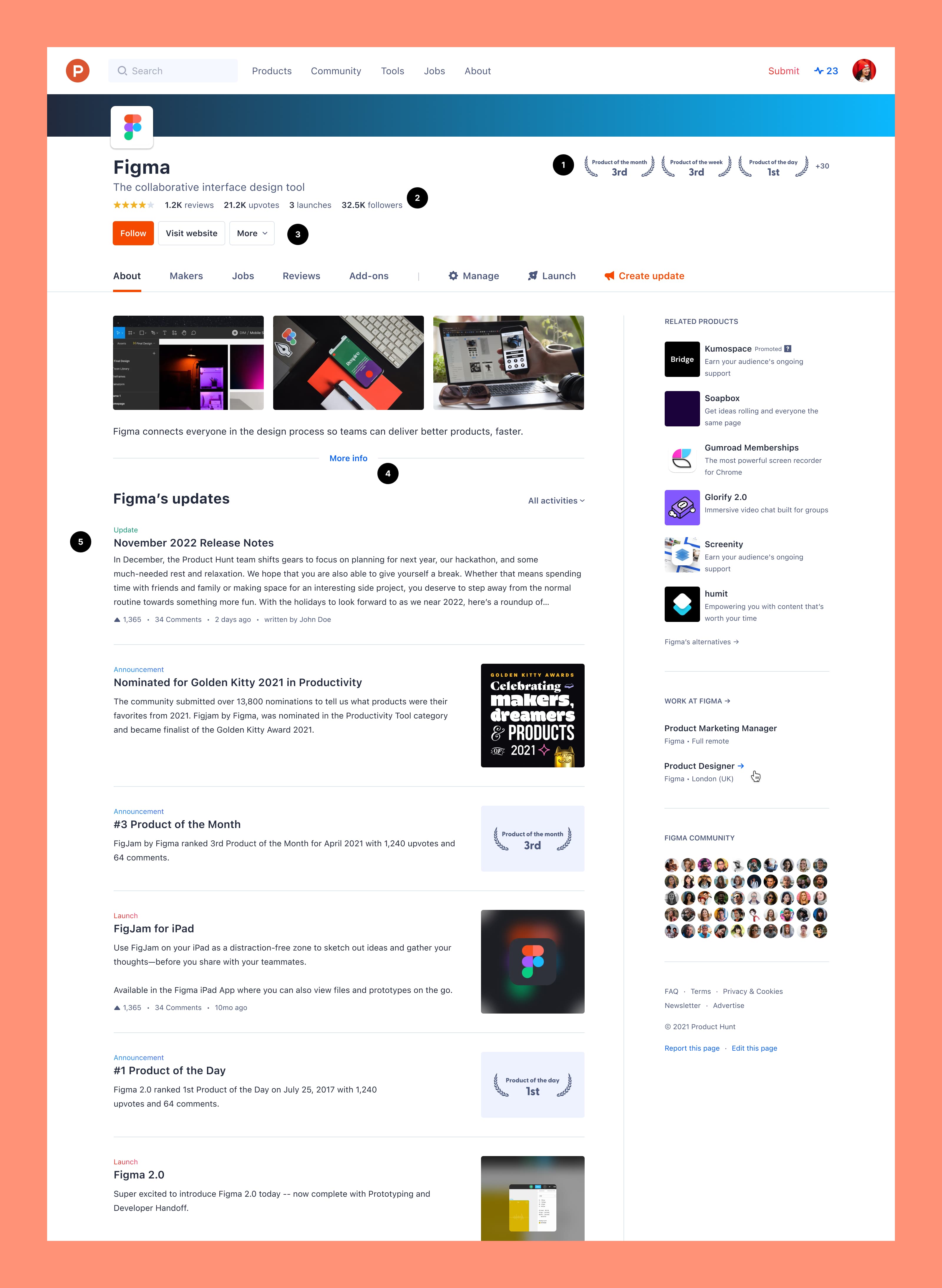
- 01Awards prominent but quickly irrelevant to organic visitors
- 02Aggregate metrics took space without helping decisions
- 03“Follow” was primary CTA instead of “Get it”
- 04Activity feed mixed launches with duplicate announcements
02 · The Approach
Redesigning for User Intent
I analyzed heatmaps and click tracking to identify what users actually cared about—understanding the current product and reaching the maker's site. I redesigned the page hierarchy to prioritize these actions and used data to convince stakeholders to remove vanity metrics. The solution: clean hero with prominent “Get it” button, chronological launch timeline with current version emphasized, and removed competing CTAs.
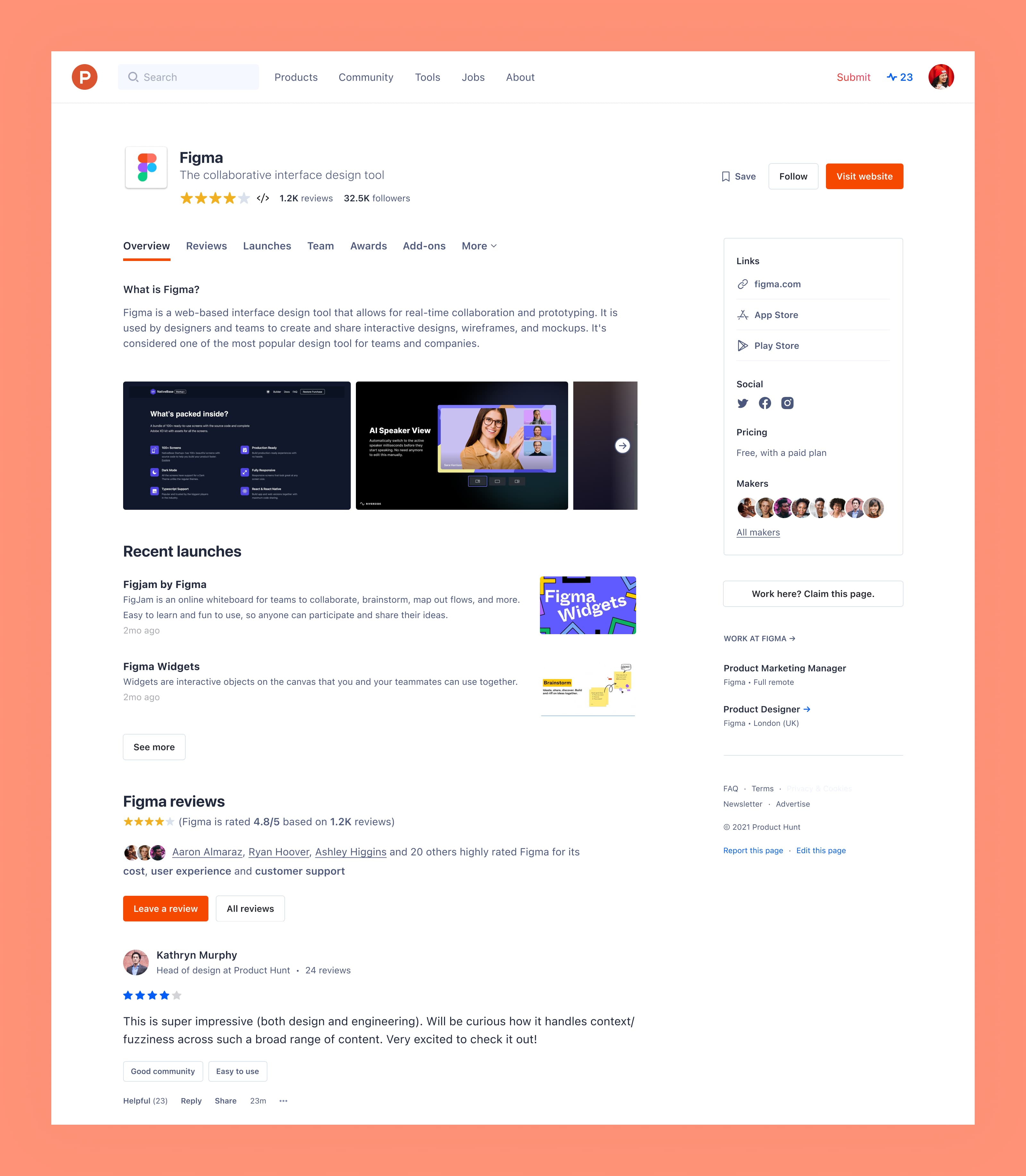
03 · In Context
The Redesigned Hub Page
Every element on the new page supported product understanding or maker site clicks. Historical versions were de-emphasized, aggregate counts removed, and redundant awards stripped away to create a focused experience centered on the current product and the primary “Get it” CTA.
04 · Reflection
Data beats assumptions. V1 was built on what we thought users valued. V2 was informed by actual click patterns and engagement metrics, and the results proved it.
Stakeholders want impressive numbers on the page, but showing aggregate metrics rarely helps users make decisions. Using click tracking data to demonstrate this made the case for stripping them back.